What the demo changes
So the home page reads as an app, not an ad.
Delivery and pick-up up front, and a Choose Details button for options.
Coupons on top, the functions people use most next.
A big pizza brand with an app that felt like an ad.
Domino's is one of the biggest pizza services in China, but its app had an outdated design and user flow that limited its user growth.
The home page highlighted ads and looked like a typical restaurant ordering screen. Customers saw it as a pre-order advertisement more than the homepage of an app.
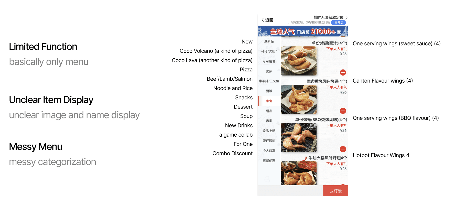
The app was basically only a menu.
Images and names made similar items hard to tell apart, like four kinds of wings in a row.
Categories mixed food types, a game collab, new drinks and combo deals in one list.
What people in China already order from.
I did competitor research on the food and drink apps people in China already use, including McDonald's, KFC, Pizza Hut, HeyTea, LELECHA and Meituan Waimai.
I looked at four parts of each one: the main structure, the landing page, the menu page and the My Profile page.
Home page
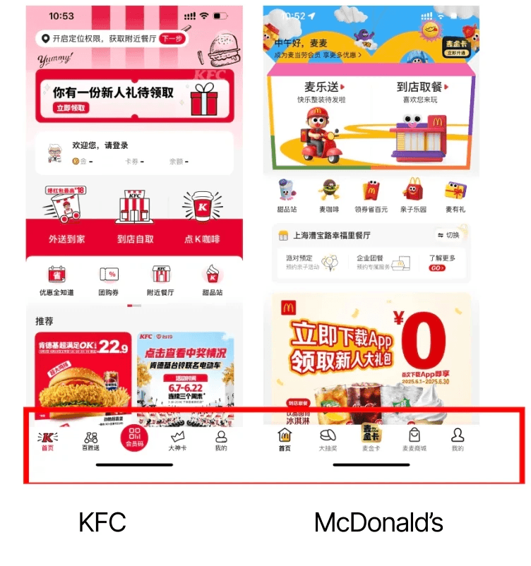
A bottom tab bar
KFC and McDonald's both split their bottom bar into Home, My Profile and a few other sections. Our app put ads first instead.
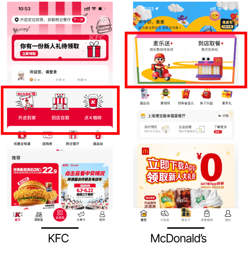
Delivery and pick-up, side by side
All the major platforms put these two main features in the top half of the home page, with icons for the brand and each function. Ads sit below them.
Menu page
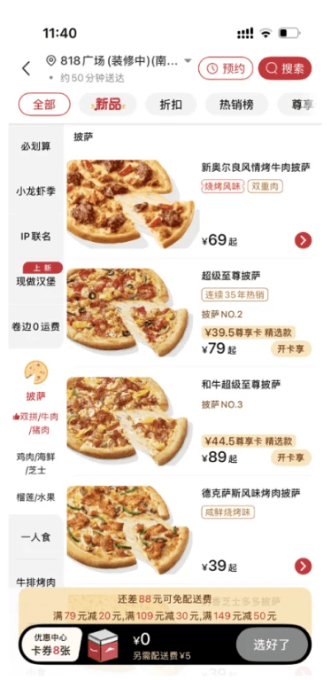
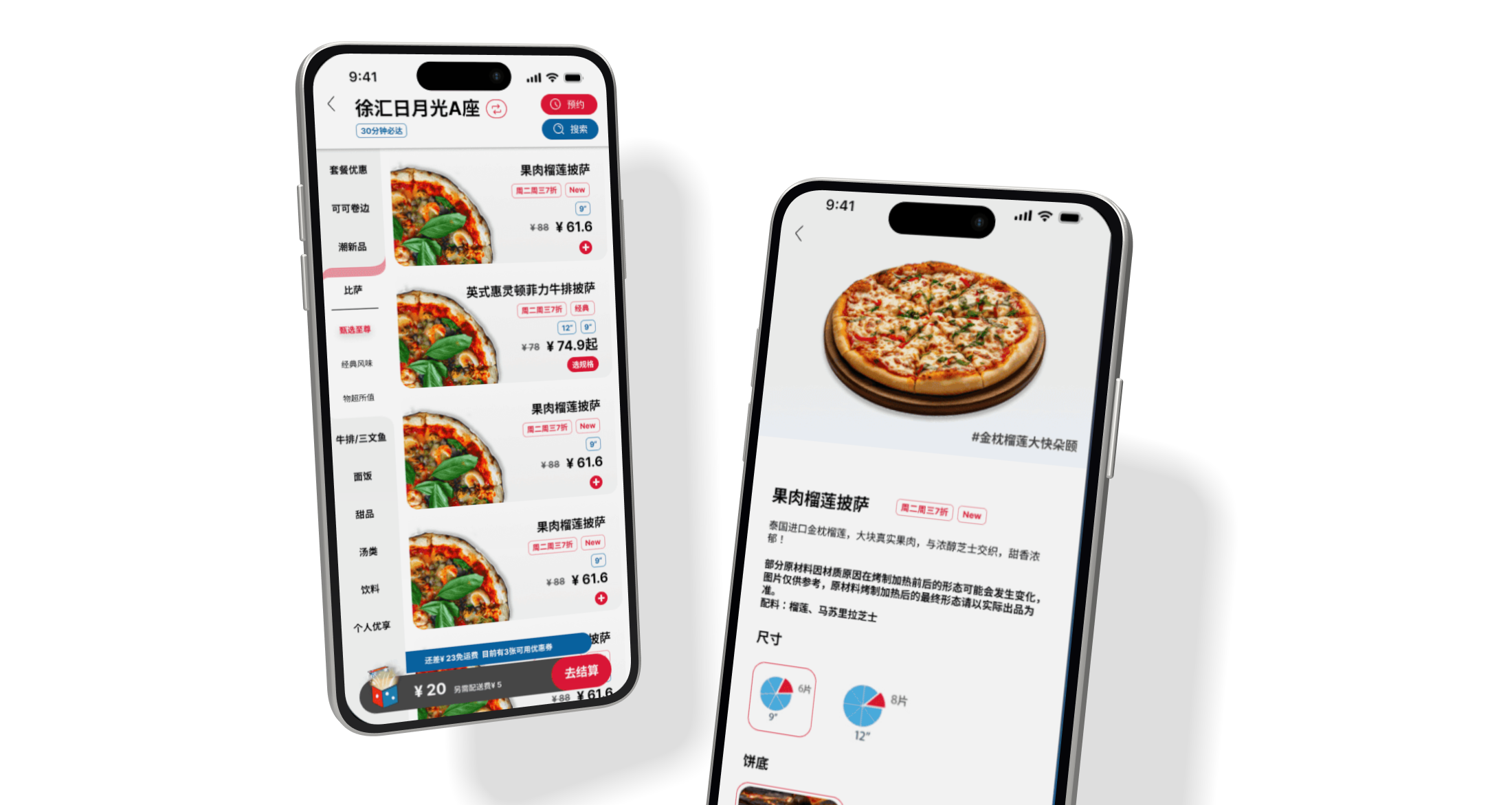
Cut-out pizza photos
The photos put the focus on the cheese and toppings, and they aren't one separate image per item.
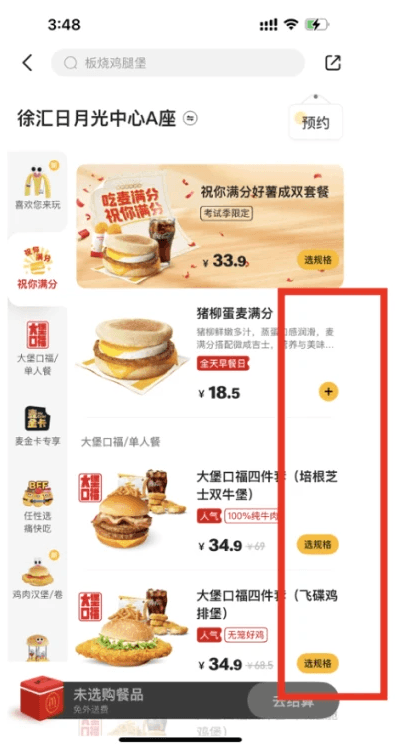
A Choose Details button
Instead of listing every combo variation as its own item like Domino's did, one button tells people they can pick the options inside.
My Profile page
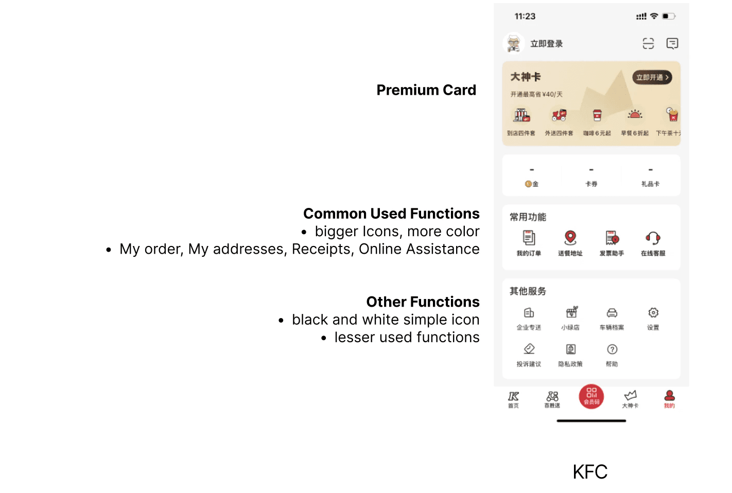
KFC splits its profile page by how often people use things: a premium card at the top, then common functions (my orders, my addresses, receipts, online assistance) with bigger, more colourful icons, then less-used functions with simple black and white icons.
Four changes from the research.
Each change comes from something the research showed people already know how to use.
The redesign
Designing around real stores.
This was my first time designing in a company setting, where a lot is restricted by logistics. At Domino's it was especially hard to change the menu system, because any change would have to be synced with the physical stores.
It's a complicated system, and there are still a lot of detailed pages left to design. That's where I'd go next.